Style
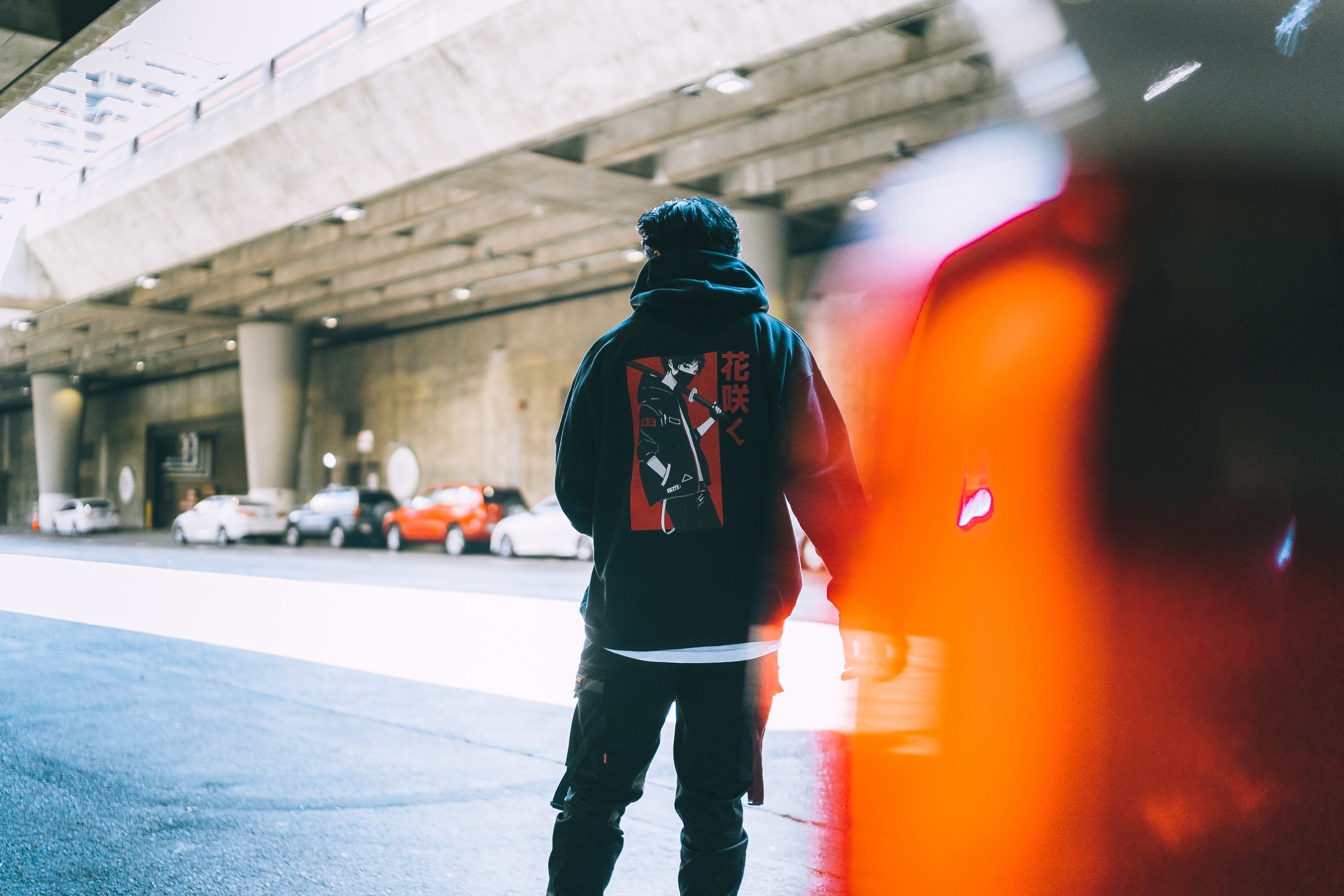
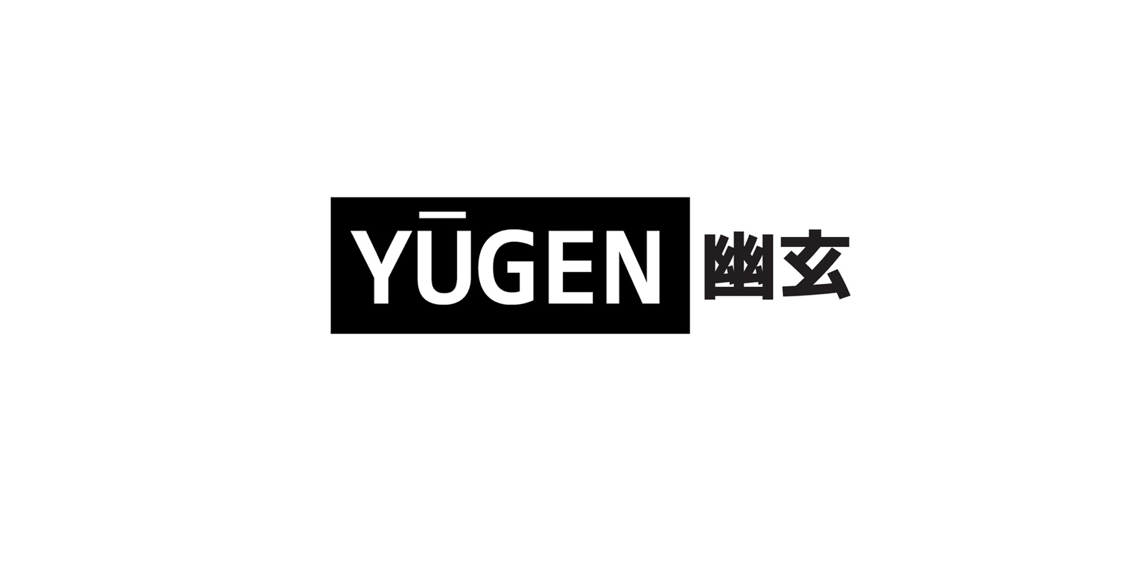
The name is the brief. Yuugen is a Japanese idea of subtle, mysterious beauty — the same feeling as mono no aware, the ephemerality the first collection was titled after. The brand had to feel like Japanese streetwear, not a merch stall: black and white as the canvas, anime- and cyberpunk-inspired graphics as the tribute to the media that shaped the work, and a wordmark quiet enough to sit on a hoodie.
Color palette
Black and off-white do the garment work. Color lives in the graphics — rose, bloom, devil — not as a wash over the brand. The lookbook stays desaturated so the illustration, not the photography lighting, is the product.
Ink
#111111
Garments, wordmark, ads
Paper
#F4F1EC
Light tees, lookbook ground
Ash
#8A8680
Captions, secondary type
Rose
#C45C6A
Bloom graphics, accent drops
Typography
The custom Yuugen wordmark carries the Japanese streetwear read. Body type stays small and cool so a collection page can hold names, prices, and sold-out states without shouting.
Inter
Shop, captions, and product names — dense enough for a drop list
Voice
“Subtle beauty of the ephemeral.” “幽玄 Streetwear.” The voice is a tribute, not a slogan — anime-inspired graphics for overlooked beauty, produced in North America.