PulseFit
A fitness and diet app for busy adults who need tracking that stays simple and personal. View case study presentation
UX/UI Lead · 4 weeks · 2026 · Solo design lead · Mobile
Tools·Figma · FigJam
A fitness and diet app for busy adults who need tracking that stays simple and personal. View case study presentation
UX/UI Lead · 4 weeks · 2026 · Solo design lead · Mobile
Tools·Figma · FigJam

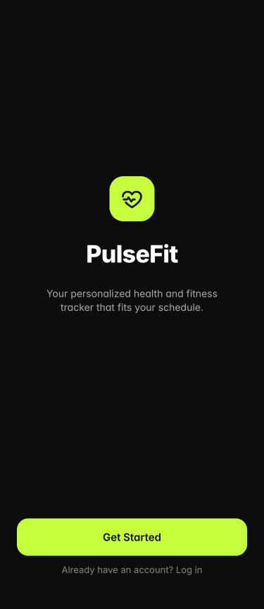
PulseFit is a health, fitness, and diet tracker for adults 18–40 who want better habits but can’t spend hours logging every detail. As sole UX/UI lead, I led research, defined the information architecture, iterated from lo-fi through usability testing, and designed the high-fidelity prototype. The product brings workouts, nutrition, and light community features together in an experience that stays quick to use day to day.
Users abandon tracking when setup and logging consume their scarce free time.
Competing products tended to be either deep and heavy, or simple and incomplete.
Calorie-only progress rarely felt motivating on its own.
Design a single fitness and diet experience that remains quick to use on busy weeks, with consistency as the primary measure of success.
In week 1 I conducted 5 interviews, reviewed MyFitnessPal, Strava, and Apple Fitness, and ran a card sort. Participants wanted fitness and diet in one place — as long as the product didn’t become another time sink.
5 sessions on motivation, current tools, and where tracking breaks down. Time pressure surfaced in every conversation.
Reviewed MyFitnessPal, Strava, and Apple Fitness with a focus on onboarding and logging, where users most often stalled.
Mapped how participants grouped fitness, diet, and social features, which informed the five primary sections.
interviews
competitors
cards sorted
29 · Product Manager · San Francisco
“I need something that fits into my busy schedule.”
32 · Occupational Therapist · Denver
“I prefer minimal and intuitive tracking.”
24 · Student · Seattle
“If it's fun, free, and competitive, I'm in.”
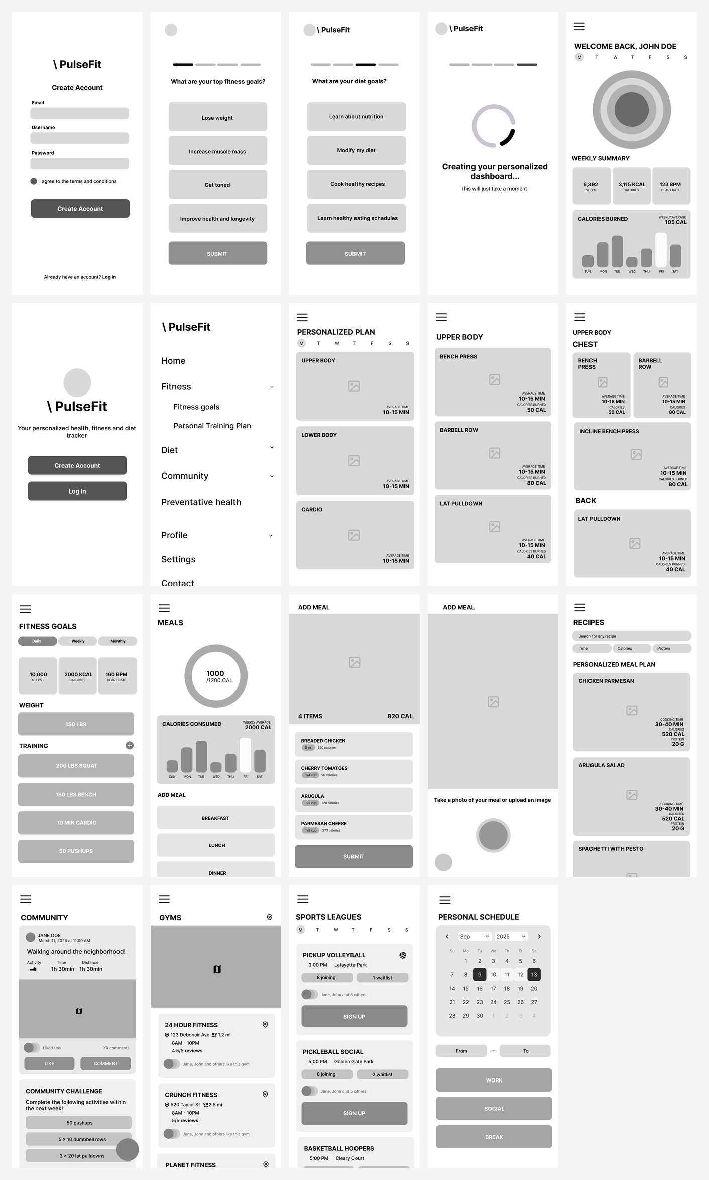
With a 4-week timeline, I focused early on flows and lo-fi structure, then moved into visual design once testing confirmed the foundation held up.
The card sort pointed to five sections — Home, Fitness, Diet, Social, and Profile — so planning and tracking stayed easy to find in day-to-day use.
I sketched the full set of flows — from onboarding through scheduling — in lo-fi first, with enough detail to validate hierarchy and task flow before moving into visual design.

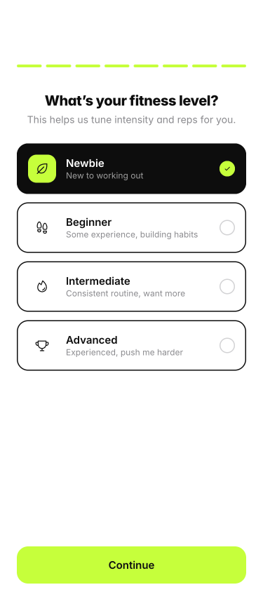
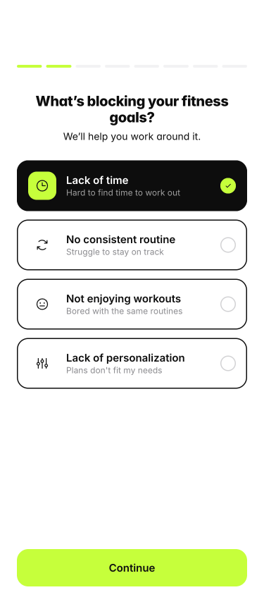
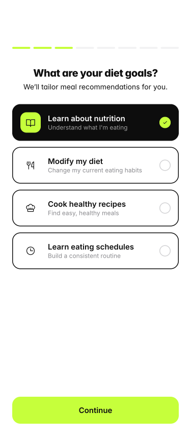
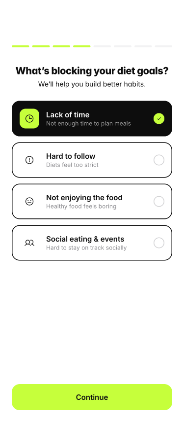
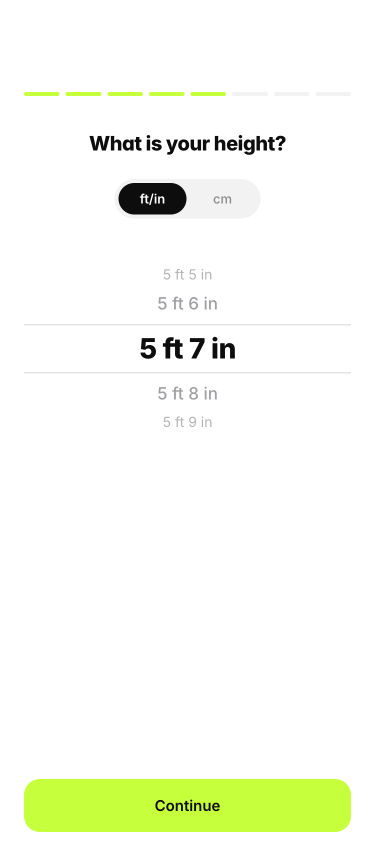
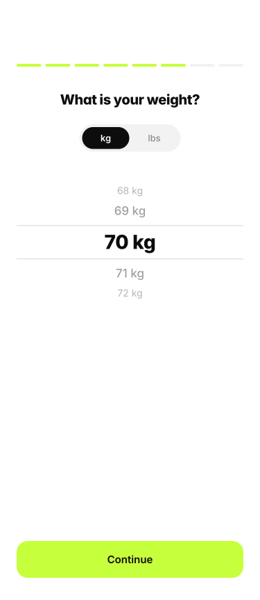
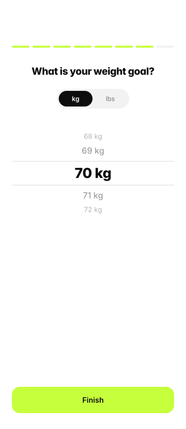
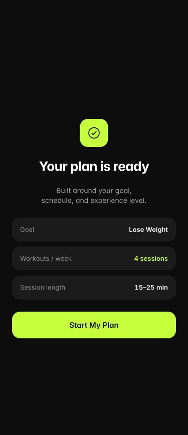
Participants wanted personalization, but lengthy onboarding reduced follow-through. I kept the quiz short — fitness level, blockers, diet goals, and key body metrics — enough to generate a plan users can begin the same day.
Asking about schedule constraints early helps the plan reflect how people actually live.
A small set of questions is enough to tune intensity and meals without a long setup.
Height, weight, and a target give the plan concrete inputs from the start.


The visual system needed to feel focused and energetic: dark surfaces for concentration, a sharp lime accent for progress, and type that remains readable on dense mobile dashboards.
Near-black backgrounds keep the product calm. Neon lime is reserved for progress rings, primary actions, and completion states so status is easy to scan. Neutral grays support secondary information.
Void
#0B0B0B
App background
Surface
#171717
Cards & sheets
Neon Lime
#C8F53A
Progress, CTAs, highlights
Snow
#F5F5F5
Primary text & icons
Mist
#8C8C8C
Secondary labels
Inter carries most of the interface — it stays clear at small sizes across rings, labels, and lists. SF Pro appears on selected health metrics for a more native iOS feel. Hierarchy relies on weight and accent color rather than oversized display type.
Inter
UI body, labels, and data
SF Pro
System metrics & native iOS feel
Fitness. Diet. Community. — practical language tied to what the user is trying to accomplish.
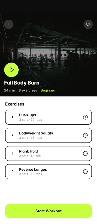
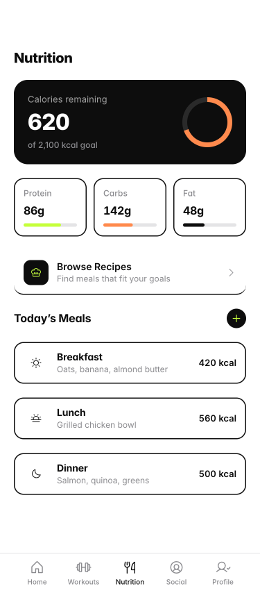
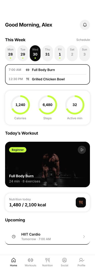
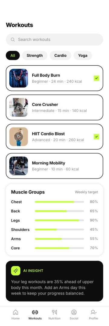
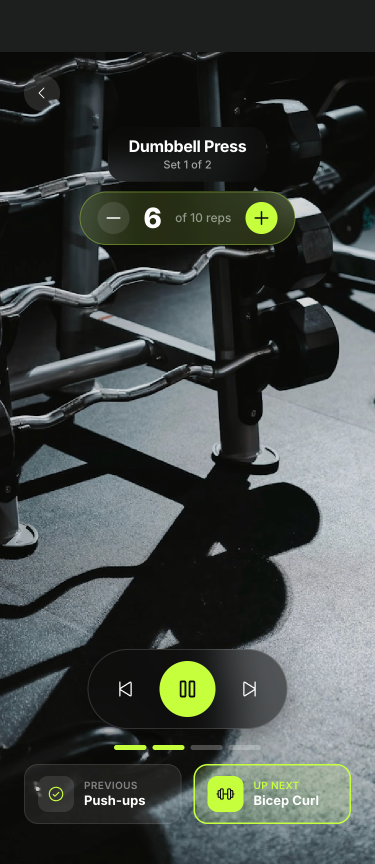
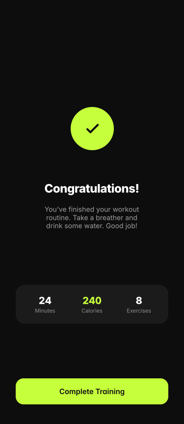
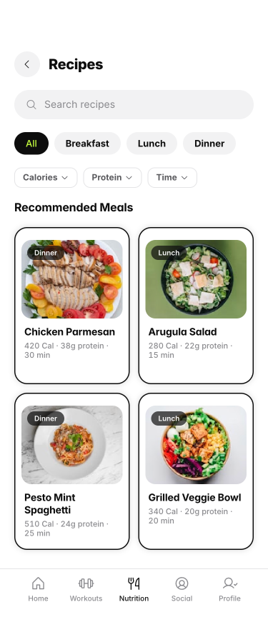
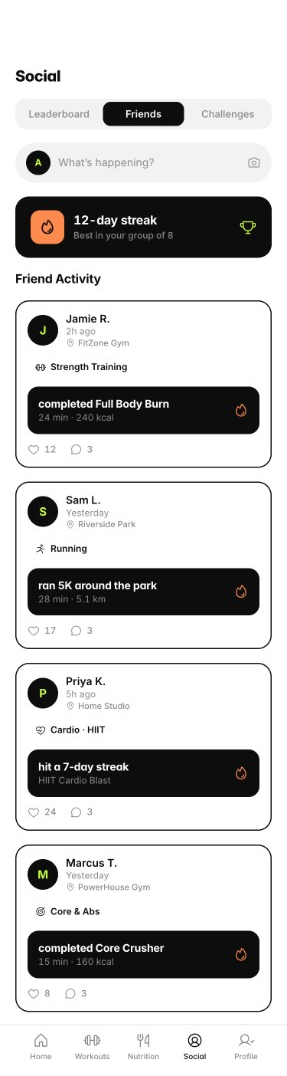
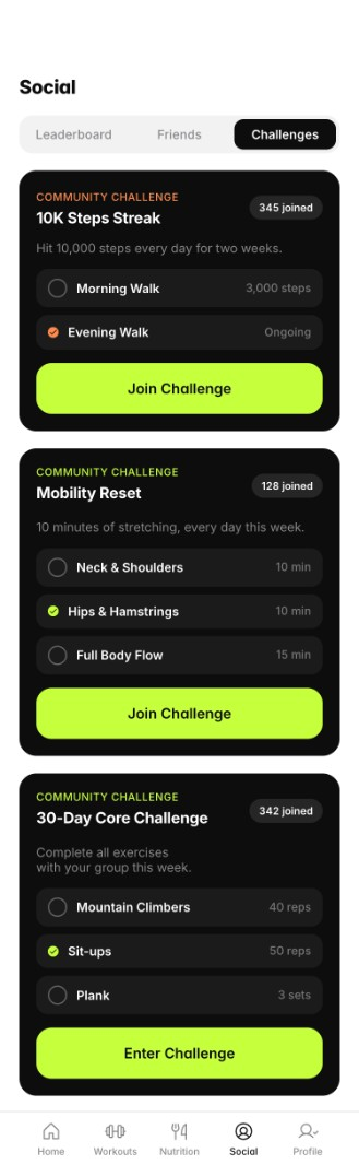
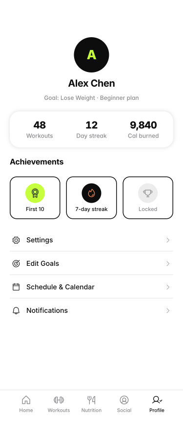
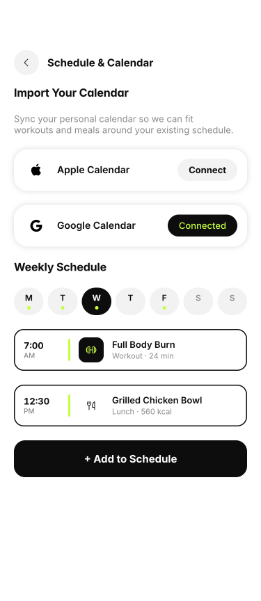
The high-fidelity UI uses a dark foundation with neon lime accents so progress stands out quickly. Workouts and diet stay intentionally light; social features focus on challenges and friends rather than a heavy feed.


PulseFit brings goals, workouts, diet, and a light social layer into one experience. Daily progress is framed in a way that stays achievable, even when logging isn’t perfect.
Rings and vitals up front so users can check in within seconds.
Sessions shaped by onboarding inputs, with progression and brief form guidance.
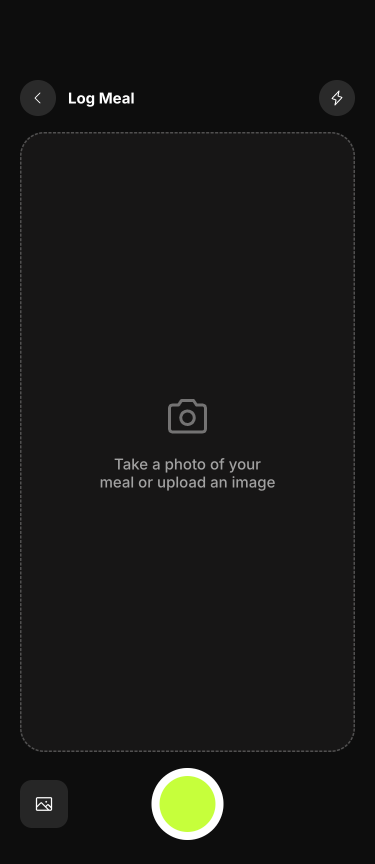
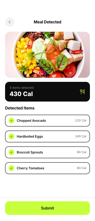
Macros, recipes, and photo logging, introduced after participants cited manual entry as their biggest pain point.
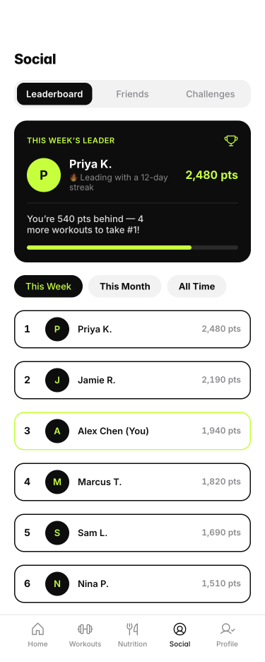
Challenges and sharing with friends — enough for accountability, without a heavy social feed.
I tested lo-fi early to catch structural issues, then ran high-fidelity sessions in week 4 on dashboard, workouts, and diet logging — the flows users would return to most often.
personas
core sections
research to prototype
The clearest takeaway was how much consistent use mattered. That influenced decisions throughout — from onboarding length to how progress is framed and what stayed out of scope.
Taking the work from interviews through a tested prototype as sole design lead, while keeping the experience usable for time-constrained users.
Next